
Choosing a Wedding Color Palette (Even If You’re Not a Designer)
Let’s be honest: choosing your wedding colors can feel like standing in front of 300 paint swatches with no idea where to start. Blush or mauve? Sage or olive? Neutrals or bold tones? Your color palette sets the tone for everything – from your florals and stationery to your tablescape and photo edits. The good news? You don’t have to be a designer to create a palette that looks intentional, cohesive, and totally you.
Here’s how to pick a wedding color palette like an art director (without the art degree).
Start with the Feeling, Not the Flowers
Before you start pinning, ask yourself how you want your wedding to feel. Dreamy and romantic? Modern and minimal? Retro and fun? That emotional cue is your north star – it helps narrow down color families that align with your vibe.
Pro tip: Save three inspiration images that aren’t wedding related like a room, an outfit, or a piece of art you love. You’ll find recurring hues and textures that naturally fit your taste.
Borrow From Your Setting
Your venue gives major clues about what works.
An industrial loft might call for moodier tones and metallics.
A garden ceremony? Soft neutrals with pops of green.
A desert elopement? Terracotta, sand, and sun-baked shades.
Instead of fighting the environment, complement it. That way, your photos will feel cohesive and timeless with no color clashes against your backdrop.

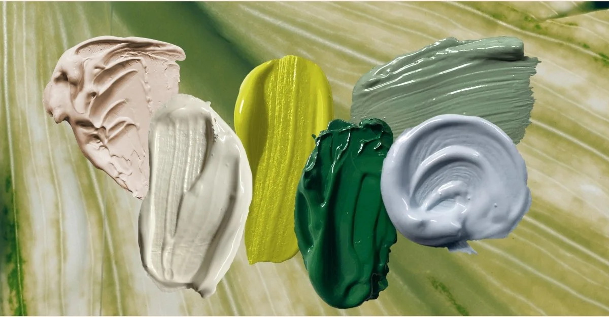
Build a Palette Like a Designer
Our secret to pro-looking color palettes is all about dynamics and contrast – a balancing act between light & dark, muted & vivid, to create a color scheme that gives you enough options to work with. When building your palette, consider the following:
Choose 1 core color range (cool colors, warm colors, or neutrals)
Within that range, pick a hero (i.e. Warm colors -> Burnt Orange)
Play with accents that compliment your hero (Perhaps a powder blue? Browns? Earthy reds?)
Pro tip: Think about how your colors will play together, but no need to give each color the same amount of spotlight! Lean-in to your hero shades and add pops of accents for an editorial look.
Consider the Season—but Don’t Be Defined by It
Yes, fall weddings often lean toward rust and burgundy, and spring weddings toward brighter shades, but that’s not a defined rule. You can absolutely do lilac in November or olive green in May. The trick? Adding accent colors that compliment, and how each color is styled. Neutral shades can help lighten the mood or add drama, no matter the season.
Test It in Real Life
Digital mockups are great, but real-world lighting can change everything. Order small swatches of fabric, paint chips, or even ribbons in your chosen hues and lay them out together near a window. You’ll instantly see which tones feel too flat or too bright.
Pro tip: Bring your color swatches to your florist or planner meeting – this helps everyone stay aligned visually (and saves you from mismatched decor panic later).
Create Your “No List”
It’s just as important to know what you don’t like. Maybe you love blush, but not when it leans coral. Or maybe you want greenery – but only olive, not emerald. Clarity here makes it easier to communicate your vision and avoid surprises on the day.

Use Tools Like a Pro
Even non-designers can tap into designer-level tools:
Adobe Color – Helps you explore complementary hues
Pinterest’s Color Search – Filters inspiration by specific shades. Upload a few inspo images and see what tones keep repeating – it’s practically a cheat sheet for your wedding colors.
Canva Color Palette Generator – Similar principle to Pinterest; upload a photo and watch it do the work for you!
Trust Your Eye (and Gut)
At the end of the day, your color palette should feel like you. If you’re torn between trends and your gut, go with what you love, because your instinct is your best creative tool. Truly great design isn’t about perfection, it’s about personal expression.
Choosing a wedding color palette doesn’t have to be overwhelming. Think of it as your creative playground, like an extension of your personal style, filtered through the lens of your love story. So settle in and start mixing tones until it just feels right.